The Cooking Oil Comparison Chart
Last Updated June 28, 2020 · First Published February 13, 2012

You already know that Extra Virgin Olive Oil is good for you. But what do you choose when it’s time to branch out and try something new? There are a lot of cooking oils out there, and many have misleading health claims on the label. It can be a bit overwhelming when you walk down the oil aisle in the store.
Some oils are very healthful, others not so much — and for different reasons. How do you know what’s really important when choosing a cooking oil? And how do you keep track of them all?
Why, with The Cooking Oil Comparison Chart, of course!
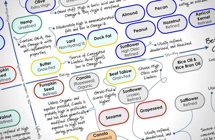
I’ve teamed up with Andy Bellatti, MS, RD, to help answer these questions with this chart. (If you don’t already follow Andy, you’re missing out.) We’ve created a one-page, printable PDF that you can take with you to the grocery story (or stick up on your fridge), that will help guide you through the labyrinth of oils.
We focused on two main factors, healthfulness and temperature-sensitivity, since some oils lose their health benefits when heated. Using a grid that makes it easy to see where each oil falls on the spectrum, you’ll be able to tell at a glance which oils to use for your salad, and which to use for your next stir-fry — and which oils to avoid altogether. We’ve also included some secondary details about each oil, along with some important pitfalls to watch out for.
Andy has written a post on his blog explaining the science behind our oil comparisons, so you’ll know why each oil is where it is on the chart. So click on over to Andy’s post to get the nitty-gritty, and then come back here and get the PDF.
The Cooking Oil Comparison Chart
792kb PDF, Last updated June 20, 2017
—
If you’d like to share this chart on your own website or blog, please be respectful (and law-abiding) and share it simply by linking directly to this post. Please do not link directly to the PDF or copy the entire chart to your own site. You may use the image at the top of this post on your own page, if you like. Thanks!
—
PS – Huge thanks to Andy for jumping on board when I proposed this project to him. I had a ton of fun collaborating with him, and appreciate his enthusiasm and expertise!
—
You may also like my other printables:
The Healthy Breakfast Flowchart
The Smoothie Flowchart
A Guide to the My Plate Icon
How to Read the Nutrition Facts Panel


I really appreciate this visual chart. Thank-you!
Hey Andrew, can you explain the hazelnut oils? There are three of them listed.
Unrefined and refined, then a plain hazelnut. Why is the plain hazelnut worst than the others?
Thanks for the chart, it’s very helpful. I learned a few new things!
Oh, my! This is a mistake on our part. (I can’t believe we both completely miss that — you’re the first person to point it out!) Please ignore the red-bordered Hazelnut oil — just put a big ol’ “X” through it.
We’re working on a “2.0” version which will clarify a few questions that have come up, as well as add a few other oils people have asked about. Should have it done early next week.
Great! I wonder if it was a mistype and should have been a different oil??? I’m sure you both will figure it out.
Thanks! I’ll look forward to 2.0
Coconut oil has a gray border and that is not explained in the color code explanation..could you please?
Thanks…great chart!
Thanks! The gray borders and gray backgrounds don’t mean anything. — they’re neutral. We just thought it looked funny without having a border on some of them. 🙂
Have you done any research on the production of coconut oil and palm oil? Are they not sourced from the same plant and isn’t that same plant being grown on clear cut tropical forests?
Are they not linked to the huge demand created after lard was banned from use in the fast food industry?
Isn’t it same industry that produces both and sells palm oil to food processors and coconut oil to the health food industry?
P
Great questions, Paul. Palm Oil and Coconut Oil do not come from the same tree (though they are both types of palms). Coconut oil does not have the same environmental issues as palm oil, and they’re separate industries.
I don’t know if palm oil use has risen because of the reduction in lard use in fast food — it’s an interesting theory, though. Do you have any data to support that idea?
I don’t see tallow on the chart? I would assume that good grass-fed tallow/suet would be superior health-wise to lard, since it has more omega 3. In fact, it’s my understanding that grass-fed tallow is the ONLY land-mammal source of omega 3’s. This is a glaring omission in this chart!
This is so helpful! I just rejoined WW and they recommend 2TSP of healthy oils per day, but they don’t agree that coconut oil is one of them! I am going to bring this chart to my next meeting.
Thank you for this chart -I’ve been struggling with the oil spectrum for a long time, and this really cuts through a lot of the confusion. I am going to write a post linking back to this today.
Best,
Lynn
Great Poster, VERY useful!
A couple of questions?
There is no colour description for grey border and grey background.
In the UK there is a LOT of rapeseed oil, usually refined, but it’s not on the chart.
Grass fed Butter is above the line and in Gold but Gold in the chart is bad for you?
Why not olive oil in glass bottles?
(OK, four questions)
Thanks!
– The gray border and background is just neutral; it doesn’t mean anything.
– Rapeseed is the same as Canola. The name was a turnoff, so they re-branded it as “Canola” instead: CANadian Oil, Low Acid.
– Cooking oils are made up of multiple types of fatty-acids, in different proportions. Butter is high in saturated ones, but grass-fed butter is also a source of CLA, and is lower in Polyunsaturated Omega-6 fatty-acids. That’s why we scored the grass-fed butter higher than grain-fed butter. The color border is an indicator that it’s high in the saturated fats, and we added the note beside it to explain the other considerations.
– Light, heat, and air degrade olive oil. Check out Andy’s post for more info, which is also linked in the PDF:
http://smallbites.andybellatti.com/the-ultimate-olive-oil-guide/
I thought grapeseed oil was good for you?? As long as it was expeller pressed…
What an excellent resource – thank you for publishing this!
Personally I try to avoid canola oil altogether, as canola is wind pollinated even organic canola crops are being contaminated by GM canola.