The Cooking Oil Comparison Chart
Last Updated June 28, 2020 · First Published February 13, 2012
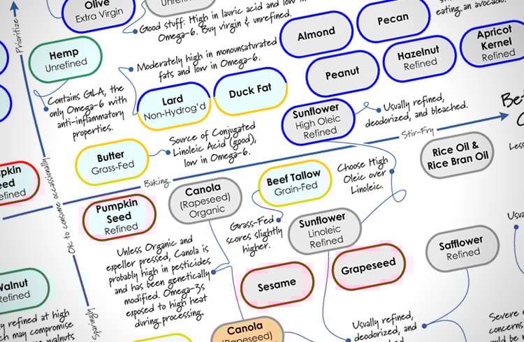
You already know that Extra Virgin Olive Oil is good for you. But what do you choose when it’s time to branch out and try something new? There are a lot of cooking oils out there, and many have misleading health claims on the label. It can be a bit overwhelming when you walk down the oil aisle in the store.
Some oils are very healthful, others not so much — and for different reasons. How do you know what’s really important when choosing a cooking oil? And how do you keep track of them all?
Why, with The Cooking Oil Comparison Chart, of course!
I’ve teamed up with Andy Bellatti, MS, RD, to help answer these questions with this chart. (If you don’t already follow Andy, you’re missing out.) We’ve created a one-page, printable PDF that you can take with you to the grocery story (or stick up on your fridge), that will help guide you through the labyrinth of oils.
We focused on two main factors, healthfulness and temperature-sensitivity, since some oils lose their health benefits when heated. Using a grid that makes it easy to see where each oil falls on the spectrum, you’ll be able to tell at a glance which oils to use for your salad, and which to use for your next stir-fry — and which oils to avoid altogether. We’ve also included some secondary details about each oil, along with some important pitfalls to watch out for.
Andy has written a post on his blog explaining the science behind our oil comparisons, so you’ll know why each oil is where it is on the chart. So click on over to Andy’s post to get the nitty-gritty, and then come back here and get the PDF.
The Cooking Oil Comparison Chart
792kb PDF, Last updated June 20, 2017
—
If you’d like to share this chart on your own website or blog, please be respectful (and law-abiding) and share it simply by linking directly to this post. Please do not link directly to the PDF or copy the entire chart to your own site. You may use the image at the top of this post on your own page, if you like. Thanks!
—
PS – Huge thanks to Andy for jumping on board when I proposed this project to him. I had a ton of fun collaborating with him, and appreciate his enthusiasm and expertise!
—
You may also like my other printables:
The Healthy Breakfast Flowchart
The Smoothie Flowchart
A Guide to the My Plate Icon
How to Read the Nutrition Facts Panel







If canola oil is ranked low only because of the likelihood that it is derived from GMOs, proves this chart is based on the ignorant opinions of luddites and not science. Also how do animal fats get anywhere on the chart except at the very bottom?
So enlighten us. Could you possibly provide facts and sources that back up your point? What information do you have about canola that we don’t? Also are you a food industry expert or do you hold any credentials that give you credibility to challenge this information? I am trying to get healthy after being diagnosed with a rare neurological disorder, I would appreciate having facts from people who have research based information and not politically based opinions that take away from people who actually need this information to heal.
Andy Bellatti, the co-creator of this chart, has a Masters degree in nutrition from New York University, and is also a Registered Dietitian. As I linked in the above article, he explains the science behind our placements on the chart here:
http://smallbites.andybellatti.com/handy-dandy-cooking-oil-comparison-chart/
I love the chart, but where does vegetable oil fall?
Hi Rob –
“Vegetable Oil” is any oil derived from a plant, and in a given bottle of the stuff it’ll often be hard (or impossible) to know what you’re actually getting. Indeed, manufacturers usually list it that way so they don’t have to be specific and can swap out highly refined oils based on market price or availability.
Having said that, in America a bottle of vegetable oil is most likely to be a blend, containing primarily soybean oil. It may very well also some include corn, canola, safflower, sunflower, and/or cottonseed oil.
Because of this variation, we couldn’t include it specifically in the chart. But if you look where we placed both Soybean and Corn Oils, that’ll give you an idea of roughly where it Vegetable Oil should land.
Thanks for the great chart.
I see you have only mentioned virgin and extra virgin olive oil to be used for non-frying cooking. My family has been on a diet of Berrio Olive Oil LIGHT, which other websites suggest to be the olive oil most suitable for high temp cooking and frying. do you agree? We are an asian family and us it for daily fish, meat, chicken curries, frying chips etc. we buy it in a 5 ltr. tin but now and then use supermarket own bran light olive oil which is a bit cheaper.
Thanks for your thoughts!
“Light” olive oil is definitely different than “Extra Virgin” olive oil. The Light oil tends to be of a lower quality, and has then been highly refined; that’s why it’s more suitable for high-heat cooking (it has a higher smoke point).
I avoid “light” olive oil, but I also wouldn’t use extra virgin for very-high-temp cooking… In our house, we usually use peanut oil or unrefined coconut oil (or some combination) instead. Look for oils that are towards the top-right corner of the chart. (It’s not to scale, but generally speaking the further to the right, the higher the smoke point.)
I am not sure if I understand this chart but do not agree with lots of stuff here…especially Canola oil is on unhealthy side but its much better than peanut and other oils…completely disagree on this !!!
Andrew,
I know how many HOURS went into your excellent fat chart. BRAVO!
SO much more helpful than hundreds of other websites.
Thank you
Thanks Jeanne! Glad you like it. 🙂
Maybe if it was right! So much is wrong.
Great chart! Since you created this chart 2 years ago, saturated fat has been found to be ok. So will you be revising this chart? For example, butter, lard and duck fat shouldn’t be gold colored border. What do you think?
HI Karen – There’s still a lot of disagreement on Saturated fat, regardless of what the internet-at-large seems to think. Our chart addresses this by noting “good” vs. “bad” saturated fats. Specifically, you’ll see coconut oil near the top, and the grass-fed butter and large scoring higher than the grain-fed versions. Hope that helps clarify!
(Personally, in the next few years, I think we’re going to continue to see even more findings of distinctions within the saturated fats category… time will tell!)
Hi Andrew. Thank you for the very useful chart. In the last few years I’ve become quite the healthy-fat fanatic, so having a quick reference chart for the pantry/kitchen will be great. I agree that you should sell this as some kind of laminated poster (or maybe a cutting board). I have a few questions for you if you don’t mind. First of all I noticed Ghee was conspicuously missing from your chart. If the milk was from pastured cows it should be slightly below and to the right of Avocado Oil. With a smoke point of (around) 500’F and some other notable health benefits I think it would be worth adding. I also couldn’t help but notice Palm Oil is listed at the very bottom. While I recognize your reasoning for this (environmental concerns and a tendency for high refinement) there are now sustainable producers selling low refinement, non-hydrogenated,… Read more »
This chart is great! I have often wondered about oils. But what about the average “vegetable oil” found at the grocery store? Which category does it fall under?
Hi Daniela! Glad you like the chart. “Vegetable oil” is a category of oils — and can be any oil (or oils) extracted from plants. In practice, however, it’s most likely soybean oil… which is towards the bottom of our chart. (That’s why we didn’t include it separately.)
http://www.chow.com/food-news/53980/what-vegetables-go-into-vegetable-oil/
Is there a place I can buy your chart? If I print it, it won’t be in color. I think your chart is great!
All oil is the epitome of junk food, pure calories with zero nutrients. Oil is the same to fat as sugar is to carbohydrates.
Wow, you are just so wrong! Most oils are full of nutrients that are healthy for your body.
If you really think that GM foods are inherently bad and organic is inherently healthier, then you’ve got bigger problems than figuring out what oil to use.
This chart is extremely hard to read, use to compare oils, or use to further any other understanding, i.e. it is not scientifically done.