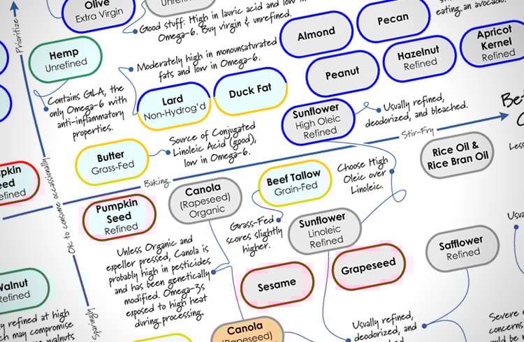
The Cooking Oil Comparison Chart
Last Updated June 28, 2020 · First Published February 13, 2012

You already know that Extra Virgin Olive Oil is good for you. But what do you choose when it’s time to branch out and try something new? There are a lot of cooking oils out there, and many have misleading health claims on the label. It can be a bit overwhelming when you walk down the oil aisle in the store.
Some oils are very healthful, others not so much — and for different reasons. How do you know what’s really important when choosing a cooking oil? And how do you keep track of them all?
Why, with The Cooking Oil Comparison Chart, of course!
I’ve teamed up with Andy Bellatti, MS, RD, to help answer these questions with this chart. (If you don’t already follow Andy, you’re missing out.) We’ve created a one-page, printable PDF that you can take with you to the grocery story (or stick up on your fridge), that will help guide you through the labyrinth of oils.
We focused on two main factors, healthfulness and temperature-sensitivity, since some oils lose their health benefits when heated. Using a grid that makes it easy to see where each oil falls on the spectrum, you’ll be able to tell at a glance which oils to use for your salad, and which to use for your next stir-fry — and which oils to avoid altogether. We’ve also included some secondary details about each oil, along with some important pitfalls to watch out for.
Andy has written a post on his blog explaining the science behind our oil comparisons, so you’ll know why each oil is where it is on the chart. So click on over to Andy’s post to get the nitty-gritty, and then come back here and get the PDF.
The Cooking Oil Comparison Chart
792kb PDF, Last updated June 20, 2017
—
If you’d like to share this chart on your own website or blog, please be respectful (and law-abiding) and share it simply by linking directly to this post. Please do not link directly to the PDF or copy the entire chart to your own site. You may use the image at the top of this post on your own page, if you like. Thanks!
—
PS – Huge thanks to Andy for jumping on board when I proposed this project to him. I had a ton of fun collaborating with him, and appreciate his enthusiasm and expertise!
—
You may also like my other printables:
The Healthy Breakfast Flowchart
The Smoothie Flowchart
A Guide to the My Plate Icon
How to Read the Nutrition Facts Panel


I notice that the walnut oil is listed as wholly “green”, yet walnuts are well known to be high in omega-6. From wikipedia’s article on the walnut “Unlike most nuts that are high in monounsaturated fatty acids, walnut oil is composed largely of polyunsaturated fatty acids (47.2 grams), particularly alpha-linolenic acid (18:3n – 3; 9.1 gram) and linoleic acid (18:2n – 6; 38.1 gram).” (LA being the omega-6)
Wiki articles are not always written by experts. I just looked at checked the Walnut Oil article. There is a disclaimer at the top stating the citations and references may require removal of some information.
The link to the .gov site is broken and some of the others may not be interpreted in the Wiki article as intended, generating the disclaimer at the top of the article.
I use Wiki for quick reference but I see it more as the opinion of writers.
Thank you!!
Copyright says I cannot publish without permission – but I have never heard of a law that says I cannot share a specific link.
Yep – though I had to add a gentle reminder that it is illegal to republish my copyrighted content on other sites. I also asked that people to link to this page rather than directly to the PDF. No legality there, just common courtesy.
Thanks,
Andrew
Thanks very much for creating this chart!
Perhaps, the people having trouble appreciating this chart are suffering from the deleterious effects from consuming too many of the oils near the bottom of said chart. Personally, I am thrilled with the sheer awesomeness (:D) of Andrew for generously sharing the results of his research in this creative, clear and concise chart. Thank you, this helps me decide the healthiest oils to use when nourishing my family!
This is so helpful! I’ve been trying to find a concise chart for the smoke points of oils so I could know which ones to cook with, but they are all different (depending on who wrote them and their opinion towards each oil). This lays everything out in a very clear way. Thank you!!
So William and Suzanne I am assuming you have a compiled a better, more knowledgeable and more attractive chart or quick reference for us to oooh and aaah about?
Please share won’t you? Oh? you haven’t put in effort into learning about nutrition and educating others?
I see.
This chart is absolutely terrible – why would you choose to lay it out in this fashion? MAybe it’s me , maybe I’m being over sensible at the risk of not being artsy or creative enough – but really… ? This is information – NOT- art.
This is the worst chart I’ve ever seen.
Love the chart – can you tell me, when I buy or you see “vegitable oil” used, where is it on the chart? I have heard Canoil Oil should be avoided at all costs because it’s basically like refined petrolium – but vegitble oil?
thanks! Seven
Vegetable Oil can be any oil derived from a plant, so you’ll need to check the label to see what oil is in a particular bottle. Often it’ll be soybean, corn, palm, or sunflower oil, or a blend of several oils. You’ll need to check each of those oils on the chart. (Most likely they’ll be in the “avoid” category!)